

Historic Paint Colors for Hilton Head Homes
- 16 minutes ago
- 6 min read
Sherwin-Williams' archived palettes — timeless, POA-friendly, and made for the Lowcountry.

Each year, there's excitement around the "Color of the Year" announcement, along with plenty of blog posts showcasing trending palettes. Everyone loves the idea of trying something new—it's always refreshing.
After painting homes on Hilton Head for 25 years, I've learned that some of the most beautiful colors aren't new at all. Many have been loved for over a hundred years and have already proven their lasting charm. They look great on walls, hold up well in real light, and never go out of style.
Sherwin-Williams offers a Historic Paint Color Collection that many people overlook. This collection features palettes directly from the company's archives—authentic colors used on American homes from the early 1800s to the 1950s.
The wonderful news? Many of these colors are perfect for Hilton Head. On an island where exterior paint choices often go through a POA or arb board, you might think "historic" sounds risky.
But it's actually quite the opposite.
These palettes were created for real homes in real neighborhoods, and their earthy greens, warm tans, soft grays, and deep, refined reds naturally match what our communities love to see. The key is knowing which colors to choose and where to use them.
The Classics (1800s–1860s)
The earliest palette in the collection features soft neutrals and gentle grays from a young American republic. Nothing fancy, nothing fighting for attention — just honest, understated color.
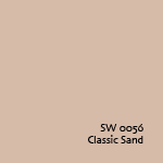
Classic Sand (SW 0056) is a cozy, earthy neutral that feels perfect for Lowcountry siding. It complements white trim beautifully and, with its subtle presence under the oaks, captures the relaxed charm of a Hilton Head home.
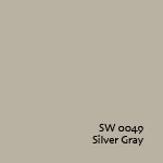
Silver Gray (SW 0049) is cooler and more reserved — morning fog drifting across the marsh. It works beautifully on siding or even a porch ceiling if you want something softer than the traditional haint blue.
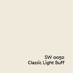
For interiors, Classic Light Buff (SW 0050) adds gentle warmth to a hallway or guest room without trying too hard.
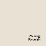
And Porcelain (SW 0053) reads like clean linen — bright, calm, and never harsh. A natural ceiling color or a quiet backdrop for rooms where art or furniture does the talking.
Victorian (1830s–1910s)
Now things get richer. The Victorian palette is full of saturated, confident colors that celebrate bold living. I'm not suggesting you go full Victorian on your Sea Pines exterior — your arb board would have a field day — but inside the house, and on certain exterior details, these colors can do serious work.
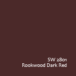
Rookwood Dark Red (SW 2801) is a deep, earthy red that feels grounded and warm without being loud. In a dining room or study, paired with cream trim and warm wood, it sets a tone people don't want to leave. On the exterior, it can serve as a front-door color or a shutter accent, where the POA allows it.
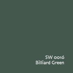
Billiard Green (SW 0016) is rich and saturated — a natural for a den, a library, or a powder room where you want some drama.
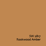
Rookwood Amber (SW 2817) brings golden warmth that plays beautifully with our late-afternoon island light. Think interior accent walls or a home office with character.
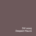
Deepest Mauve (SW 0005) — don't let the name throw you. It's a muted, dignified purple-brown that can add unexpected depth to a smaller room or a tray ceiling. One of those colors that makes people ask what it is without being able to put their finger on it.
Colonial Revival (1870s–1900s)
This might be the most naturally Hilton Head-friendly era in the entire collection. The Colonial Revival palette mixes paler tones with richer accents, inspired by a return to classical American design. That same balance — calm but intentional — is exactly what our island communities are built around.
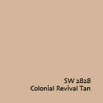
Colonial Revival Tan (SW 2828) could pass for a color already approved in half the plantations on the island. It's a warm, sandy neutral with just enough personality to feel like a choice rather than a default. A strong exterior body color.
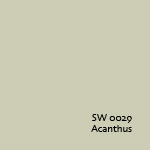
Acanthus (SW 0029) is a muted, earthy green that belongs on shutters or a front door. Calm and grounded — the way a Lowcountry house should feel from the street.
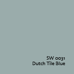
Dutch Tile Blue (SW 0031) is a dusty, grayed-down blue with real versatility. It works on interior cabinetry, a mudroom, or as a porch ceiling color if you want a step beyond traditional haint blue.
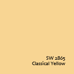
Classical Yellow (SW 2865) brings a cheerful warmth to a kitchen or breakfast nook without tipping into a brightness you'd regret by Tuesday.
Arts & Crafts (1880s–1910s)
The Arts & Crafts movement celebrated honest materials, simplicity, and nature. If your home has exposed beams, stone accents, wood paneling, or a big stone fireplace, this palette was practically built for you.
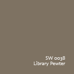
Library Pewter (SW 0038) is a rich bronze-brown that anchors a room. On a fireplace wall or a built-in bookcase surround, it feels like it's been there forever.
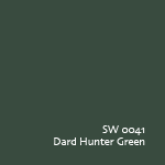
Dard Hunter Green (SW 0041) is deep and serious — a true craftsman green that pairs beautifully with warm wood tones, leather furniture, and iron hardware.
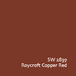
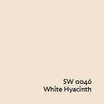
Roycroft Copper Red (SW 2839) has an orange warmth, like old brick or terra cotta. On a front door against gray or tan siding, it turns heads in the best way. And for trim alongside any of these
White Hyacinth (SW 0046) is a soft, creamy white that ties everything together without the starkness of a pure bright white.
The Jazz Age (1920s)
The Jazz Age palette gives you subtle pastels and classic neutrals as a backdrop, with bold, saturated accents that make a statement. Some would say I'm old enough to have played trumpet in this era — I'm not, but I've been swinging long enough to appreciate the colors.
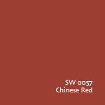
Chinese Red (SW 0057) on a front door or entryway trim is confident and warm — a strong choice against white or cream exteriors.
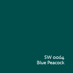
Blue Peacock (SW 0064) is rich and jewel-toned, the kind of color that makes a powder room or accent wall feel like a discovery.
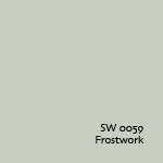
Frostwork (SW 0059) is a soft, icy green that's perfect for a bathroom or sunroom — light and airy yet with real color.
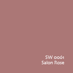
Salon Rose (SW 0061) brings a warm, muted rose tone that works in bedrooms or sitting areas where you want something feminine without being delicate.
The Streamlined Years & Suburban Modern (1930s–1950s)
As we move into the mid-century, the palettes get brighter and more playful.
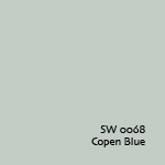
Copen Blue (SW 0068) is a soft, approachable blue that works in bedrooms, living rooms, or anywhere you want calm with a little color.
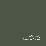
Vogue Green (SW 0065) is a classic mid-century sage — grounded and easy to live with.
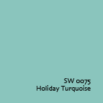
From the Suburban Modern era, Holiday Turquoise (SW 0075) is pure mid-century fun. It's playful in the right setting — a sunroom, a laundry room, a kid's bathroom.
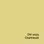
And Chartreuse (SW 0073) — if you've got a room that needs a jolt of energy, this yellow-green has been making people smile since the Eisenhower administration. Use it sparingly and it rewards you.
Don’t Forget About Your POA Guidelines
In many Hilton Head neighborhoods, you'll find that getting approval for your exterior paint colors before you begin painting is a common step. Each plantation association has its own set of guidelines, and some are quite detailed. This is just a part of living here, and honestly, it really helps preserve the beautiful and unique look of the island we cherish.
The good news is that most of the colors in the Sherwin-Williams Historic Collection were designed with this kind of restraint in mind. They were made for neighborhoods, not for showrooms. The neutrals, the muted greens, the earthy reds and tans — they tend to land well within the range that most POAs and arb boards are comfortable with. And because they carry the weight of history behind them, they don't feel like compromises. They feel like choices.
At Daygig Painting, we've built relationships with most of the POAs and arb boards on the island over the years. We work closely with homeowners and their boards to make sure everyone ends up with a color choice that satisfies all sides.
You can explore the full Sherwin-Williams Historic Paint Color Collection here. And if you'd like a hand picking the right ones for your home, inside or out, let us know!
Thank you!


Billy Howe
Founder, Daygig Painting

Daygig Painting
8 Quail Walk Lane
Hilton Head Island, SC 29926


Comments